While trying out the Windows 8 Consumer Preview I noticed a number of usability problems and interface designs that could be done better. This review outlines problems and solutions/recommendations relating to the sidebars, start screen, and power actions in Windows 8 Consumer Preview. But first, a little about me…
About Me
I’m an interface designer and developer with experience creating apps and games for various platforms with different input devices. My current job revolves around creating UI systems and games for iPad and iPhone games using Mac OSX, but at heart I am a big Microsoft fan and always treasure my time working in Windows while developing for Microsoft’s new platforms.
I also am primarily responsible for recommending and supporting my family members’ computers systems. They all take my recommendation seriously and it greatly impacts their purchase decisions.
Sidebars (Charms Bar and Metro App Task-Switch Bar)
The sidebars are a critical element of the new Windows 8 experience and are the single starting point for managing the system and it’s apps. These sidebars are also cornerstone when using a mouse. Let’s see how they fair:
- Good: Works great with touch screen.
- Good: By including the start screen thumbnail in the bottom of the left sidebar, historical functionality of the “Start Button” is maintained for desktop users that prefer their taskbar along the bottom of the screen.
- Good: When there are no other Metro apps open, only the start screen thumbnail appears, rather than the whole bar.
- Good: Sidebars do not appear during use of fullscreen desktop apps.
- Problem: Accessing the sidebars with a mouse is not intuitive, difficult, and complex:
- Not intuitive, difficult:No visible buttons combined with a very small mouse-over region (5×5 pixels) causes for a very difficult first experience for some users.
- When I asked my mother to open up Mail she tried opening Internet Explorer a few times, subconsciously thinking it was the start button, and then basically gave up, not having a clue what to do next. I tried telling her to move the mouse to the bottom corner: She did, but was never able to get into the small 5×5 pixel area, even though she was only using a single monitor. In her very words: “Don’t hide things from people like your mother!”
- Not intuitive: The top left and bottom left corners use pop-up thumbnails, similar to the Windows 7 taskbar – Except when you move your mouse to the center of the thumbnail, it disappears altogether. Both myself and my mother made this mistake of trying to click on the center of the thumbnail, causing it to disappear.
- Difficult: Bringing up the sidebars is finicky and difficult on multimonitor setups.
- Complex:To bring up the sidebars multiple actions are required, each presenting an opportunity for mistake, especially on multimonitor setups.
- Move to the 5×5 pixel area in the corner.
- Move straight up or down without leaving the approx. 10-pixel-wide invisible column. The invisible column seems to be much wider on the charms bar
- Not intuitive, difficult:No visible buttons combined with a very small mouse-over region (5×5 pixels) causes for a very difficult first experience for some users.
- Problem: When using a mouse the top-left icon of full-screen desktop apps (which I commonly double-click to close windows) is partially blocked by the metro-app switcher thumbnail when metro apps are open.
It’s not just my mother and I that are confused about the sidebars and find them hard to use. Watch how Sebastian from ExtremeTech becomes confused about how to use the left sidebar in this video.
Recommendation: Movable Hotspot Icons
I’ve put together a quick video demo of a solution that would address the problems and maintain historical conventions to make for a simple, easy and intuitive experience when using a mouse to access the sidebars. Skip ahead to 1:36 if you want to jump right to the recommendation.
Start Screen and Apps
- Good: Differentiation between Metro apps and Desktop apps:

- Good: Quick access to apps like in Windows Vista start menu (start, type, Enter key).
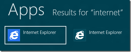
- Problem: Internet Explorer is inconsistent to Metro/Desktop app conventions.
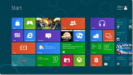
- Problem: Desktop vs. Metro apps can be difficult to differentiate for new users in some cases. Which of the following are Metro and which are Desktop?

Recommendation: Increase Visible Differentiation Between Tiles and Desktop Apps
Expose both versions of Internet Explorer in start screen searches. This not only maintains convention, but is also a common teaching technique: While in a safe environment, such as the start search screen, force the user to learn and understand the difference between Metro and Desktop apps. This avoids problems caused by not understanding the distinction between these types of apps.
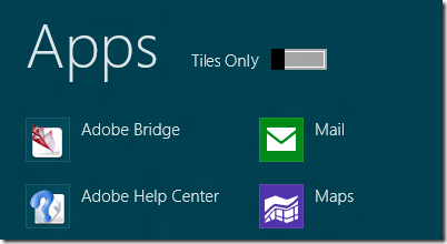
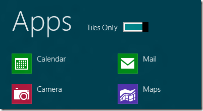
Include a Metro Apps only (“Tiles Only”) switch. This will not only help reinforce the difference between app types, but also make using a tablet more accessible by avoiding the desktop interface altogether.
Make the differentiation between Desktop and Metro apps more easy to see for new users. One way could be by changing the icon for Desktop apps to have rounded corners or something more distinguishable:
Power Actions
- Problem: Power options are difficult to find (hidden in settings submenu).
- Problem:Power actions are slow to access with keyboard compared to previous versions:
- Windows 7:
- Windows key
- Right arrow key
- Enter key (selects default power option)
- Windows 8 Consumer Preview:
- Windows key + I
- Up arrow key
- Enter key
- Up arrow key (repeat until desired option)
- Enter key
- Windows 7:
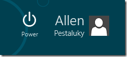
Recommendation: Power Button on Start Screen
With a power button on the start screen you both start and end your sessions on the same screen. With this icon on the start screen it should be easy to make a shorter series of key presses to access power actions.
License
Of course my intent is that these designs be modified and implemented by Microsoft, so these designs are provided for free for all purposes without royalty or warrantee.

Comments
One response to “Windows 8 Consumer Preview Usability Review”
As I user interface designer myself I just took my first look at Windows 8 (Release Preview) and was shocked by the terrible desktop experience with a mouse too. There’s too much to mention here, but accessing the side bars is indeed more than troublesome. I love your idea about the movable hotspot icons! Hope they implement something like that.
Not so sure about your metro and desktop description though. Why, as a user, do I need to know which is ‘Metro’ and which is ‘Desktop’? It is not a distinction users make (or want to make), but something Microsoft did. I just want my app to get work done! In practice, I think you won’t be mixing touch with mouse input. And productivity (i.e. in Office like environments) is something completely different from tablet like experience, so I think we are better off just separating the two entirely (though both could be in the same OS).