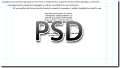
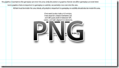
I am currently in the process of porting Hideout! to the Xbox 360 with XNA. As a part of this process, I needed to create a Photoshop GUI template for my GUI artist to ensure that our game would work well on all TVs. I thought this template may be useful to other developers as well:
This file is essentially a compilation of notes from Best Practices for Indie Games and this topic. The guides (cyan lines) that you see are markings for 10% and 20% of total width and height. I chose these markings based on some comments by Shawn Hargreaves concerning development of professional games for the Xbox:
Native Xbox games have two different safe areas. They are strongly recommended to keep everything within 80%, and strictly required to keep everything within 90%. A single UI pixel outside the 90% region is an instant cert fail. UI outside the 80% region is going to get mentioned in the cert report, and they’ll most likely be asked to fix it, but if a big commercial developer pushes back and decides they don’t want to do that, it’s not a totally rigid requirement.
For indie games, there is no official cert and thus no rigid fail threshold. Our recommendation for indie games is exactly the same as for commercial titles: Microsoft thinks all games should keep all UI within the 80% region, and would love it if every developer would do this.
I have included notes about font size, as well as how much space is needed if you would like to make a 4:3 alternative.
4:3 Alternative
This 4:3 alternative can be achieved by simply changing the BackBuffer width in XNA to 960px instead of 1280px and letting XNA do the rest of the scaling. To stay within the 20% to 10% title safe area, you will need between 256 (20%) and 288 (10%) pixels in between left, center, and right aligned GUI elements. When you have shrunk the width to 960px, your GUI elements should still just fit within the title safe area after being moved closer together so long as you have left this extra space.
Concluding Thoughts
As a designer, I do understand the challenge of creating a well balanced and pleasing layout without being able to use 20% of your screen space… But that said, I must say that if you are looking to create a game that everyone can enjoy (which I hope you are), you should take on the challenge of keeping all critical elements within that 80% area. The minimum font size of 14 points is also a bit on the small size: Do not use this for common gameplay text, but instead lean towards around 20 point at minimum.

